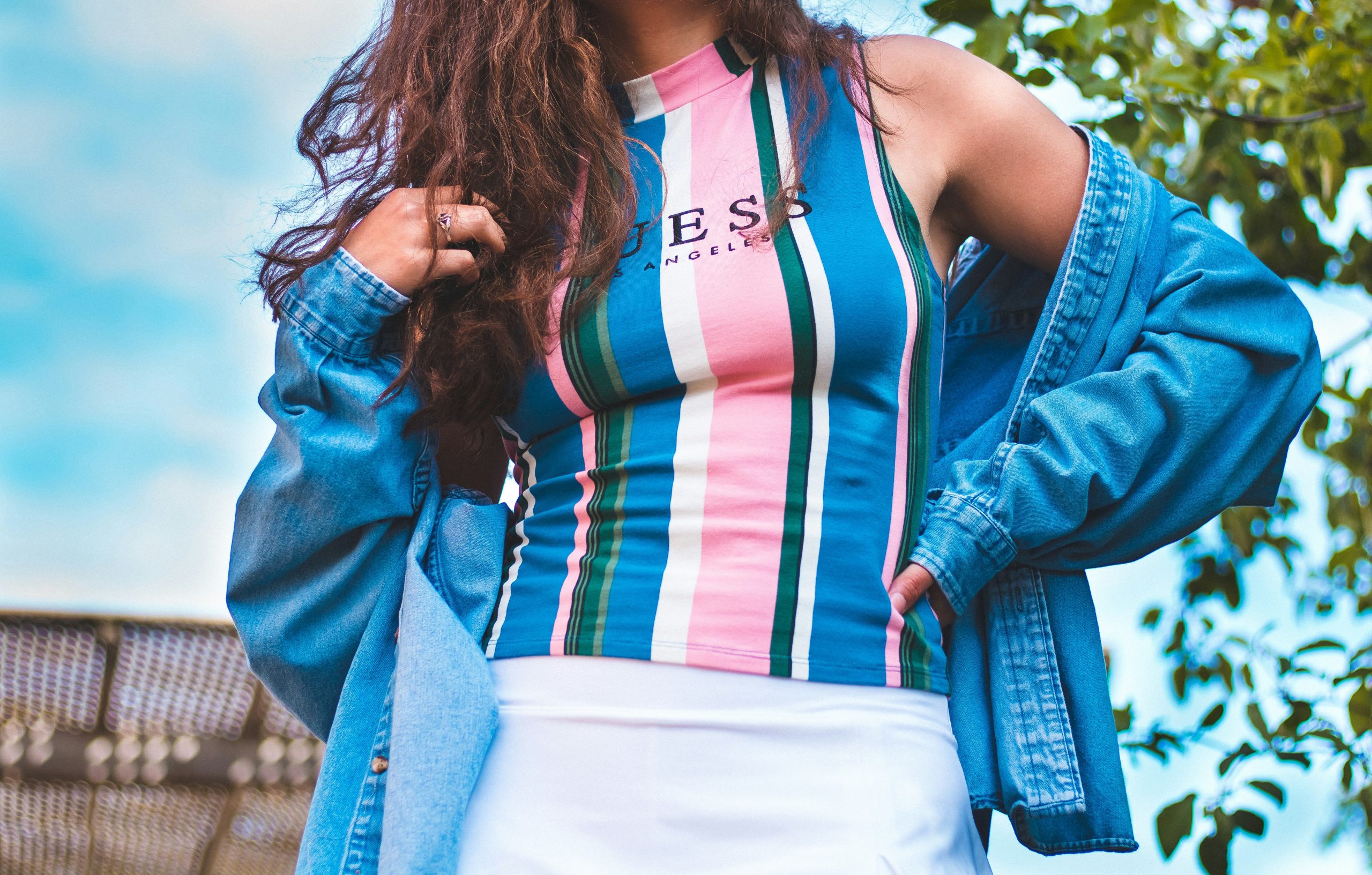
You open your closet, pull out a navy sweater and gray trousers, and something feels off. The pieces are fine. The fit is decent. But the whole thing looks flat. Most people assume they need more expensive clothes to fix this. They don’t. The real issue is almost always color.
Stylish outfits don’t happen by accident. They happen when certain colors land next to each other in a way that feels intentional. You can wear a $20 shirt and look sharper than someone in a $200 shirt if your color choices work better.
Why Some Colors Just Look Better Together?
Let’s get one thing straight. There is no single “stylish color.” That’s not how this works. A bright neon yellow jacket can look incredible in the right context. A charcoal gray sweater can look awful if paired wrong. The style comes from the relationship between colors.
Think of it like music. A single note isn’t good or bad. But two notes played together create harmony or tension. Colors work the same way.
The most stylish outfits rely on a few reliable patterns: contrast, continuity, and accents. You don’t need to learn complex color theory. You just need to recognize these three patterns when you see them.
High Contrast (Bold and Clean)
High contrast means light against dark. Think black trousers with a white shirt. Navy blazer with light beige chinos. This works because the eye can quickly separate each piece. It looks sharp, confident, and put-together. Most people look better with some contrast in their outfit.
Low Contrast (Subtle and Expensive)
Low contrast uses colors that sit close to each other on the color spectrum. Olive pants with a cream sweater. Charcoal pants with a faded black tee. This feels softer, more relaxed, and often looks more expensive because it doesn’t scream for attention. The downside? It can look muddy if you don’t vary texture or shade enough.
The Accent Rule (One Small Pop)
This is the secret weapon of stylish dressers. Build the whole outfit with neutral or muted colors, then add one small area of brighter color. Bright orange socks. A burgundy belt. A forest green watch strap. That single accent makes the whole outfit look considered without trying too hard.
The Most Reliable Stylish Colors (And How to Use Them)
Some colors do more work than others. If you want outfits that consistently look stylish without reinventing the wheel every morning, focus on these.
Navy Blue
Navy is almost cheating. It pairs with everything. It looks professional but not stiff. It hides wrinkles and stains better than black. And it works on every skin tone.
Wear navy with: gray, white, brown, cream, olive, rust, burgundy. Avoid navy with: black (looks like a mistake unless done very intentionally), bright royal blue (too matchy-matchy).
Earth Tones (Olive, Brown, Rust, Cream)
Earth tones have become the signature of stylish casual wear for a reason. They feel natural, warm, and grounded. An olive jacket looks good over almost anything. Brown leather shoes work with every non-black pant. Cream sweaters brighten your face without being stark.
The trick with earth tones is mixing them together. Olive and rust work beautifully. Brown and cream feel classic. The only real miss is combining too many earth tones that are too similar—olive pants, brown shirt, tan jacket can turn into a muddy mess.
Charcoal and Mid-Gray
Gray is the ultimate neutral because it doesn’t compete. A gray sweatshirt looks casual but never sloppy. Gray trousers dress down a blazer or dress up a t-shirt. Unlike black, gray doesn’t feel harsh or formal by default.
Most people own black but should own charcoal. Black absorbs light and can make you look washed out or severe. Charcoal sits in the middle—dark enough to be grounding, soft enough to be friendly.
Off-White and Cream, Not Pure White
Pure white looks great for about thirty minutes. Then it picks up a smudge, and suddenly you look like you slept in your clothes. Off-white and cream stay cleaner longer and feel less aggressive. A cream linen shirt looks ten times more stylish than a stark white Oxford cloth button-down in most casual settings.
Burgundy and Oxblood
These deep reds act like neutrals once you start wearing them. A burgundy sweater works with navy, gray, brown, olive, and cream. It adds warmth without being loud. It’s the color people notice but can’t quite name, which is exactly where you want to be.
What Colors Make Outfits Look Less Stylish?
Avoiding bad combinations is just as important as finding good ones. These are the common killers.
Black and Brown (The Old Rule That Won’t Die)
Someone once said never wear black and brown together. That person was wrong, but only partially. The real problem is dark black with warm brown. Black shoes with a brown belt looks disjointed. A black jacket over a brown shirt can feel heavy and confused.
The fix: use very light brown (tan, cognac) with black, or keep black and very dark brown far apart in the outfit. Better yet, just pick one.
Matching Too Exactly
Navy pants with a navy shirt. Gray pants with a gray hoodie. This almost never looks stylish. It looks like a uniform or a mistake. If you want to wear the same color family, vary the shade significantly—light gray pants with a charcoal sweater. Or break it up with a different color in between.
Neon and Pastel Together
Bright lime green with soft baby pink. Electric blue with mint. These combinations fight each other. One is screaming, the other is whispering. It creates visual chaos. If you wear neon, wear it with black, white, or gray. If you wear pastel, wear it with navy, cream, or brown.
The Biggest Mistake Beginners Make
Here it is. The number one reason outfits look unstylish: ignoring your own coloring.
You can follow every color rule perfectly and still look tired, washed out, or disconnected from your clothes. That happens when the colors you wear fight your natural skin tone, hair color, and eye color.
This isn’t about “seasons” or complicated analysis. Just look at yourself in natural light.
- Warm skin tones (yellow, peach, golden undertones) look better in warm colors—olive, rust, cream, brown, warm navy, burgundy. Avoid icy blues, stark white, and cool grays.
- Cool skin tones (pink, blue, red undertones) look better in cool colors—true navy, charcoal, pure white, jewel tones like emerald and sapphire. Avoid orange, warm brown, and mustard.
The easiest test: hold a pure white piece of paper next to your face in sunlight. Then hold an off-white cream. Which one makes your skin look more alive? That tells you everything you need.
Practical Color Combinations That Always Work
Stop guessing. Use these blueprints.
| Main Color | Pair With | Accent Color | Vibe |
|---|---|---|---|
| Navy | Light gray | Rust | Smart casual |
| Olive | Cream | Brown leather | Relaxed, outdoorsy |
| Charcoal | White | Burgundy | Sharp, evening |
| Brown (mid) | Blue (light) | Cream | Vintage, easy |
| Black | White | Any single bright color | Minimalist, bold |
| Cream | Olive | Navy | Soft, approachable |
Three Full Outfit Examples
Example 1 (Office or dinner)
- Navy blazer.
- Charcoal trousers.
- White Oxford shirt.
- Brown leather belt and shoes.
- Why it works: High contrast between blazer and shirt, low contrast between blazer and trousers, warm leather accent.
Example 2 (Weekend coffee)
- Olive green chore coat.
- Cream cotton sweater.
- Mid-brown chinos.
- Tan suede boots.
- Why it works: All earth tones in different shades. Nothing matches exactly. Looks effortless.
Example 3 (Night out)
- Black denim jacket.
- Chargray henley.
- Dark wash jeans (not black, not light).
- Black boots.
- Burgundy beanie.
- Why it works: Near-monochrome with texture doing the work. Small burgundy pop keeps it from being boring.
How to Fix an Outfit That Feels Wrong?
You’re standing in front of the mirror. Something is off. Don’t start over. Try these fixes in order.
- Change one accessory. Swap a black belt for brown. Switch from white sneakers to cream. A single swap changes the whole color conversation.
- Add a third color. Two-color outfits often feel flat. Navy pants + gray shirt = fine. Navy pants + gray shirt + tan jacket = stylish.
- Remove the wrong neutral. Black shoes with brown pants is usually the culprit. Change the shoes or change the pants. Don’t keep both.
- Check the saturation. Are both colors equally bright or equally muted? That’s often the problem. A bright shirt needs a muted pant. A muted sweater needs some pop somewhere else.
When to Break the Rules?
Every stylish person eventually ignores the rules. But they do it on purpose.
You can wear all black. It works when you vary texture—leather, cotton, wool, denim. All black in the same fabric looks like a costume.
You can wear bright colors together. It works when the rest of your outfit is completely neutral. Hot pink sweater with orange sneakers is a disaster. Hot pink sweater with white pants and beige sneakers is a statement.
You can wear black and brown. It works when the brown is very light (tan suede) or the black has faded to charcoal. Dark black with dark brown still looks bad.
The rule for breaking rules: know why the rule exists first. Then decide if your specific outfit has a good reason to ignore it.
Bringing It All Together
You don’t need a closet full of expensive clothes to look stylish. You need colors that work with each other and with you. Navy, earth tones, charcoal, cream, and burgundy will do most of the heavy lifting. Avoid exact matching, pay attention to your skin tone, and use small accents to add interest.
The next time you get dressed, spend thirty extra seconds looking at the colors. Ask yourself if they feel intentional or accidental. That small pause is the difference between an outfit that works and one that just covers your body.
Frequently Asked Questions
What is the single most stylish color for men’s clothing?
Navy blue. It’s versatile, flattering, and works in casual and formal settings better than any other color. Most stylish wardrobes are built around navy pieces.
Do I need to match my belt and shoes exactly?
Not exactly, but close. Brown belt with brown shoes works even if shades differ slightly. Black belt with black shoes should match closely. Brown belt with black shoes almost never works.
Can I wear two different shades of the same color?
Yes, but keep the shades far apart. Light gray pants with a charcoal sweater works. Light gray pants with a medium gray sweater looks accidental.
What color makes an outfit look expensive instantly?
Cream and off-white. Pure white looks harsh and stains easily. Cream looks soft, natural, and reads as higher quality even on cheap fabrics.
Should I wear colors that match my eyes?
It can look nice but don’t force it. Matching your eye color exactly often looks too posed. A similar tone in the same family is better. Blue eyes with a muted blue sweater works. Blue eyes with a bright blue shirt looks like a gimmick.
How many colors should be in a stylish outfit?
Three is the sweet spot. Two can work but risks being boring. Four or more gets chaotic unless you’re very skilled. Three colors—two neutrals and one subtle accent—is the easiest path to looking stylish.